Improving the browsing and in-room experience for audio rooms with live AI summaries.
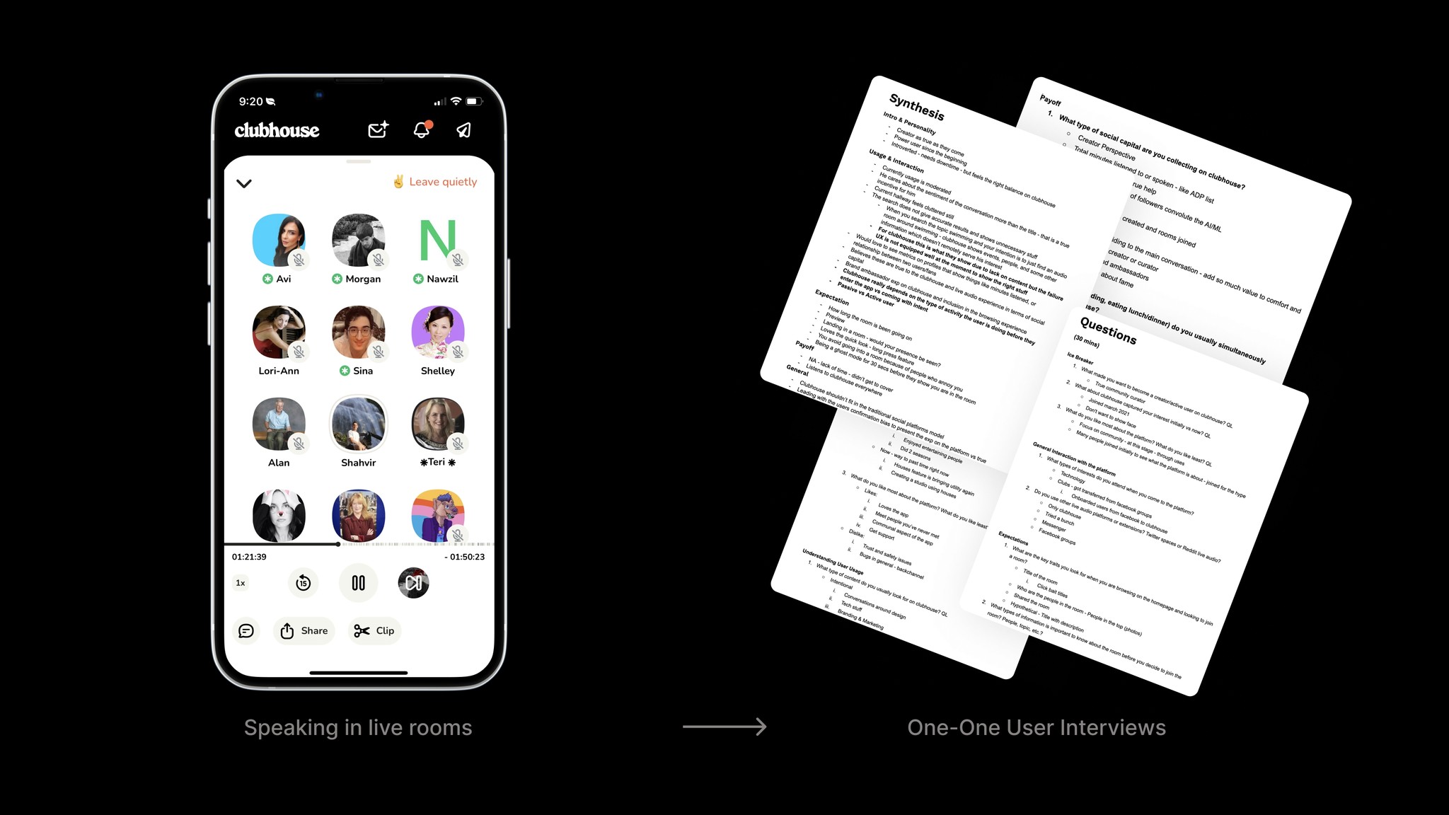
Personal Case Study
.
CONTEXT
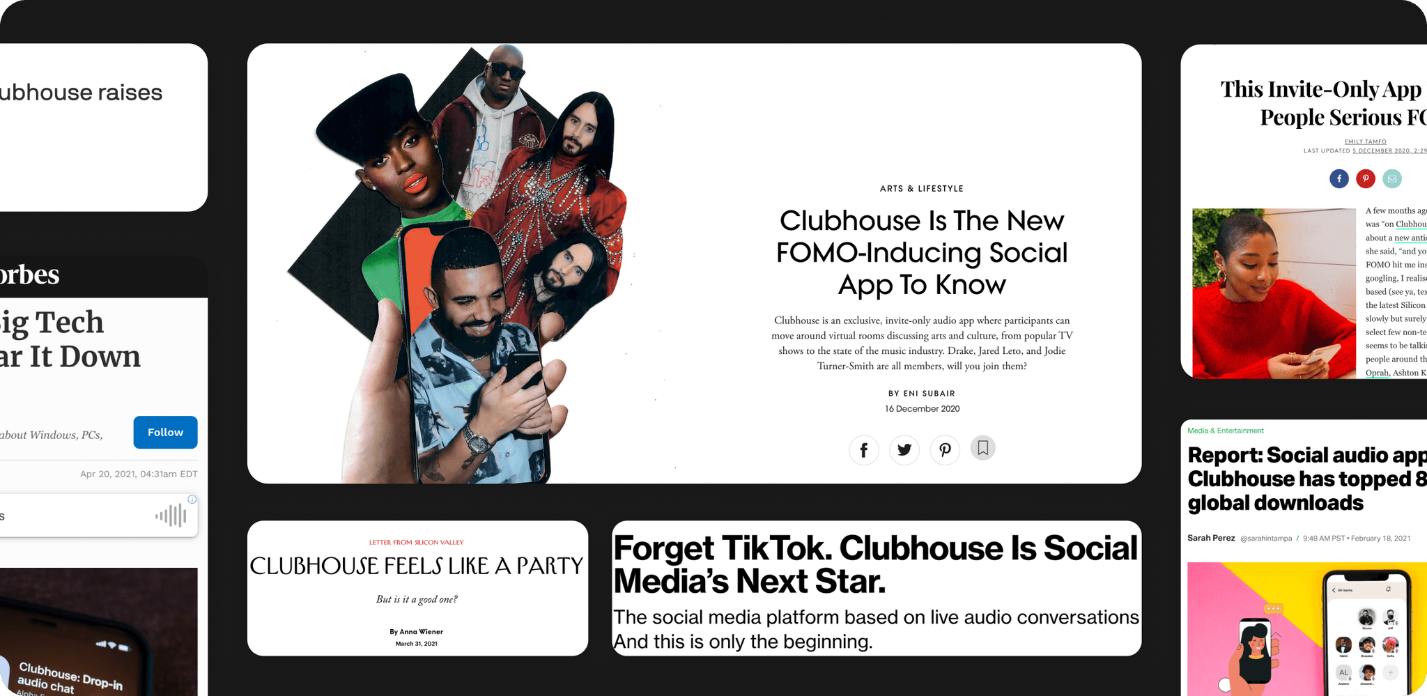
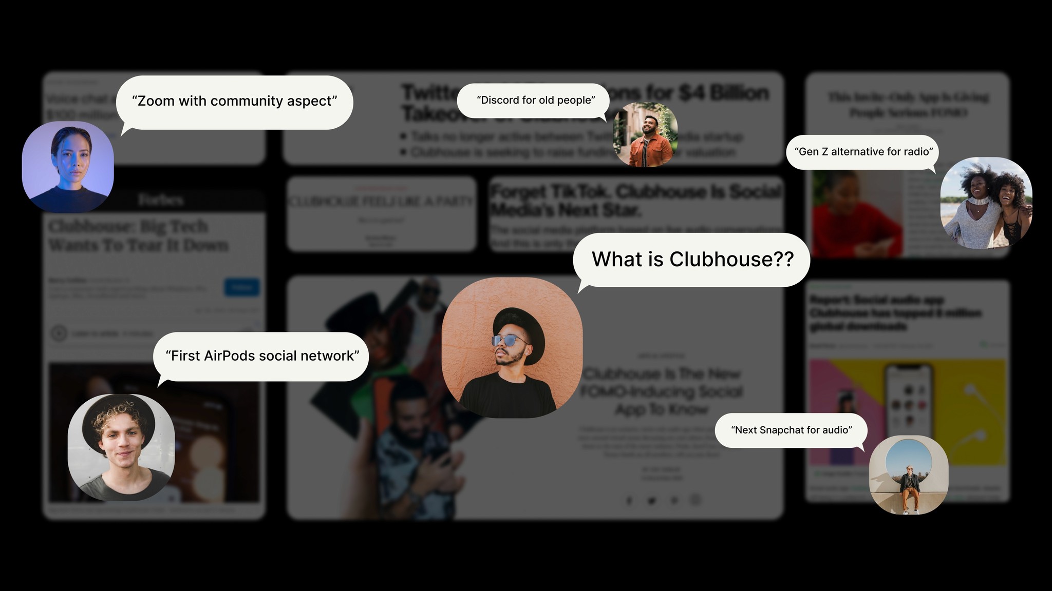
Clubhouse's Bumpy History
Clubhouse gained a lot of steam with celebrity engagement and appearances from the likes of Elon Musk, Mark Zuckerberg, Drake, and Oprah alongside a $4B valuation. Unfortunately, as the initial hype cycle died down after the pandemic, it wasn’t clear if Clubhouse had found its product-market fit as a social app and its retention rate started dropping exponentially.
PROBLEM BREAKDOWN & SCOPING
Breaking Down The Problems
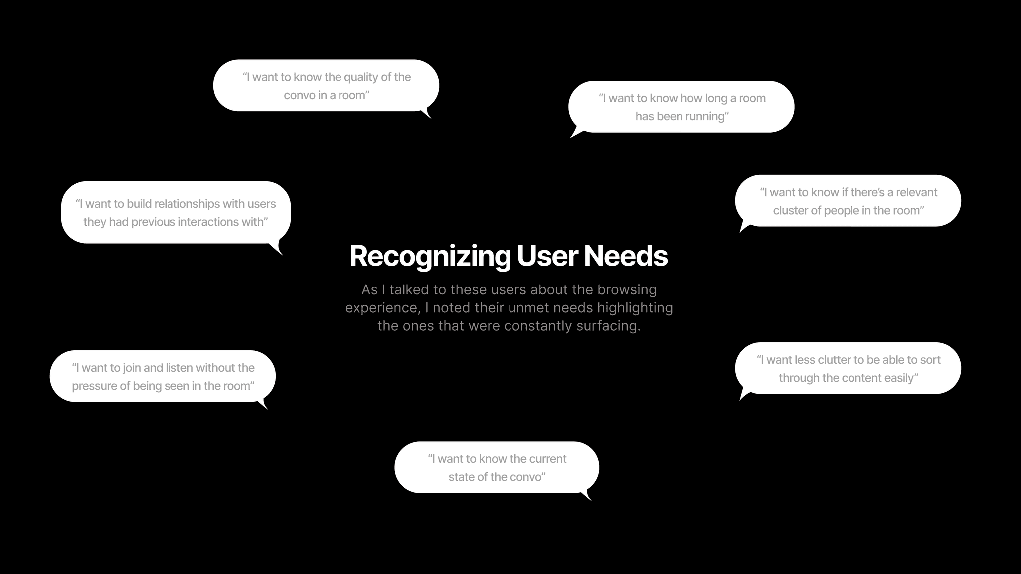
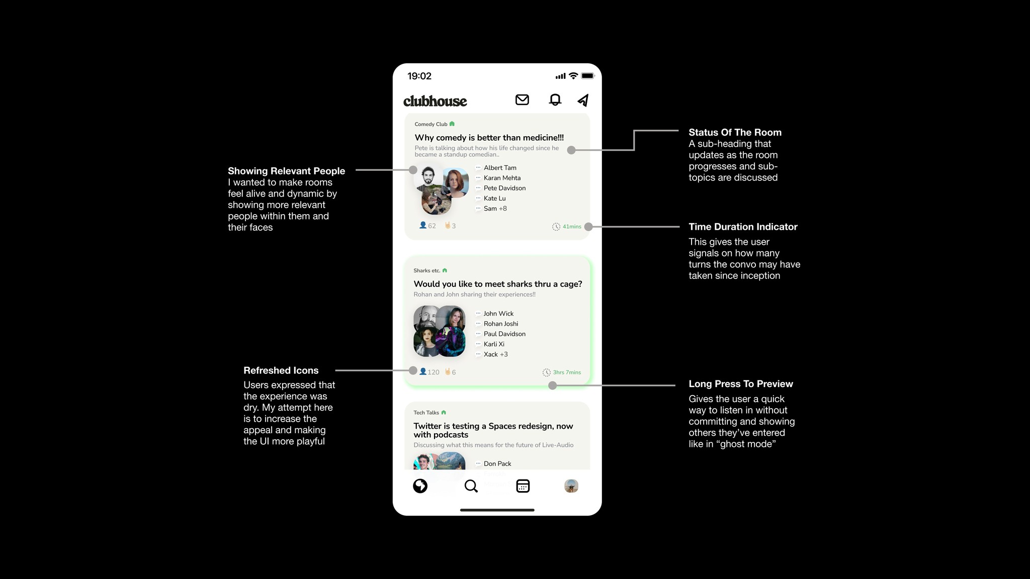
#1 The static browsing experience is leading to user churn + low retention
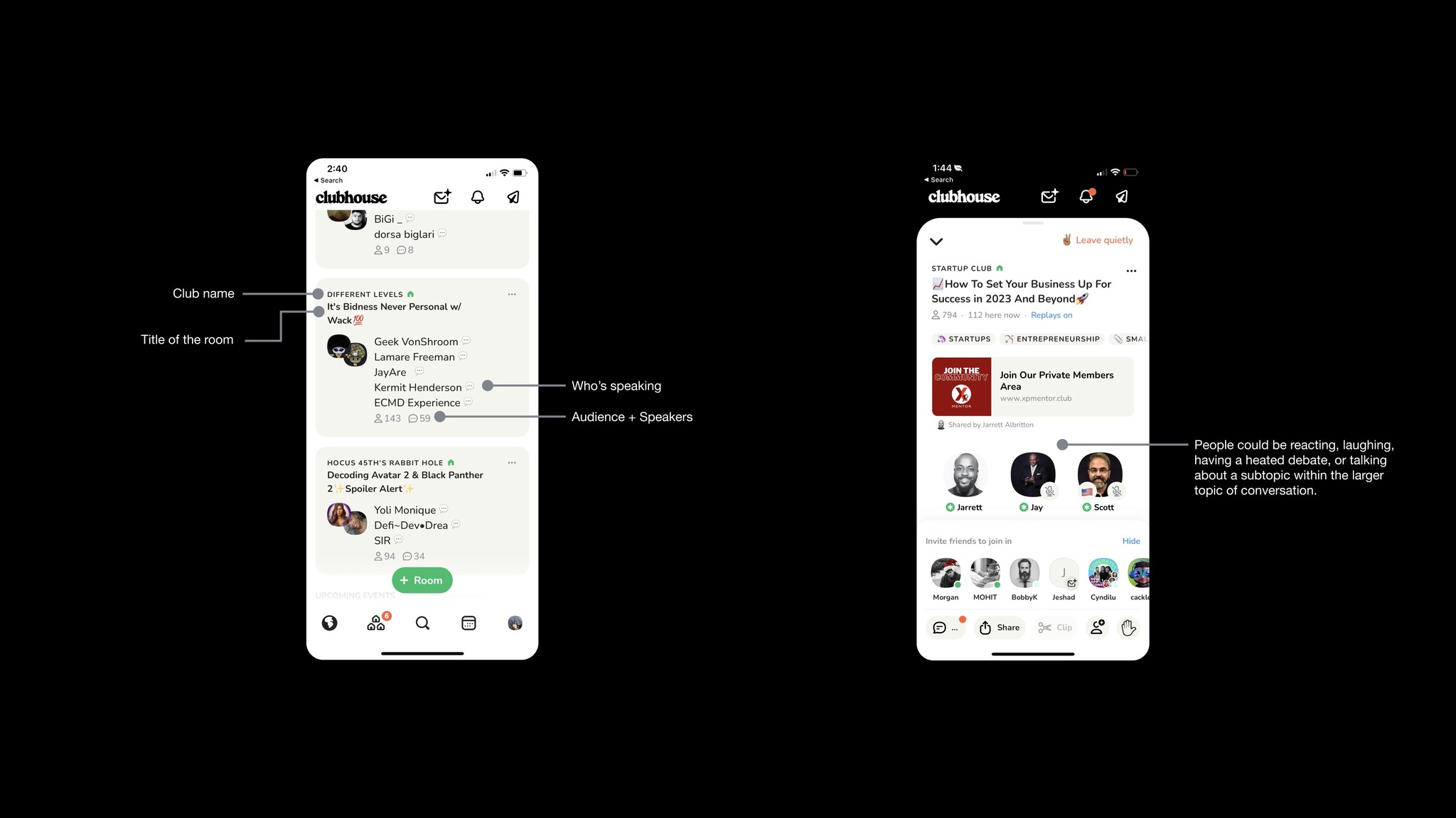
The current thumbnail design fails to give good signals about the unique and dynamic nature of a live audio room. Participants could be reacting, laughing, having a heated debate, or talking about a subtopic within the larger topic of conversation.
.
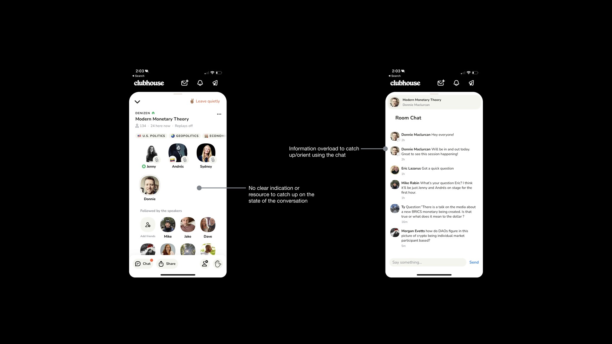
#2 The lack of continuity and difficulty orienting in a live room
Users often enter into a new speaker introduction, a sub-discussion, or an altogether off-topic conversation. They need a way to reorient themselves upon entering the room otherwise it leads to drop-off.
.
#3 Clubhouse’s lack of content recommendation strategy
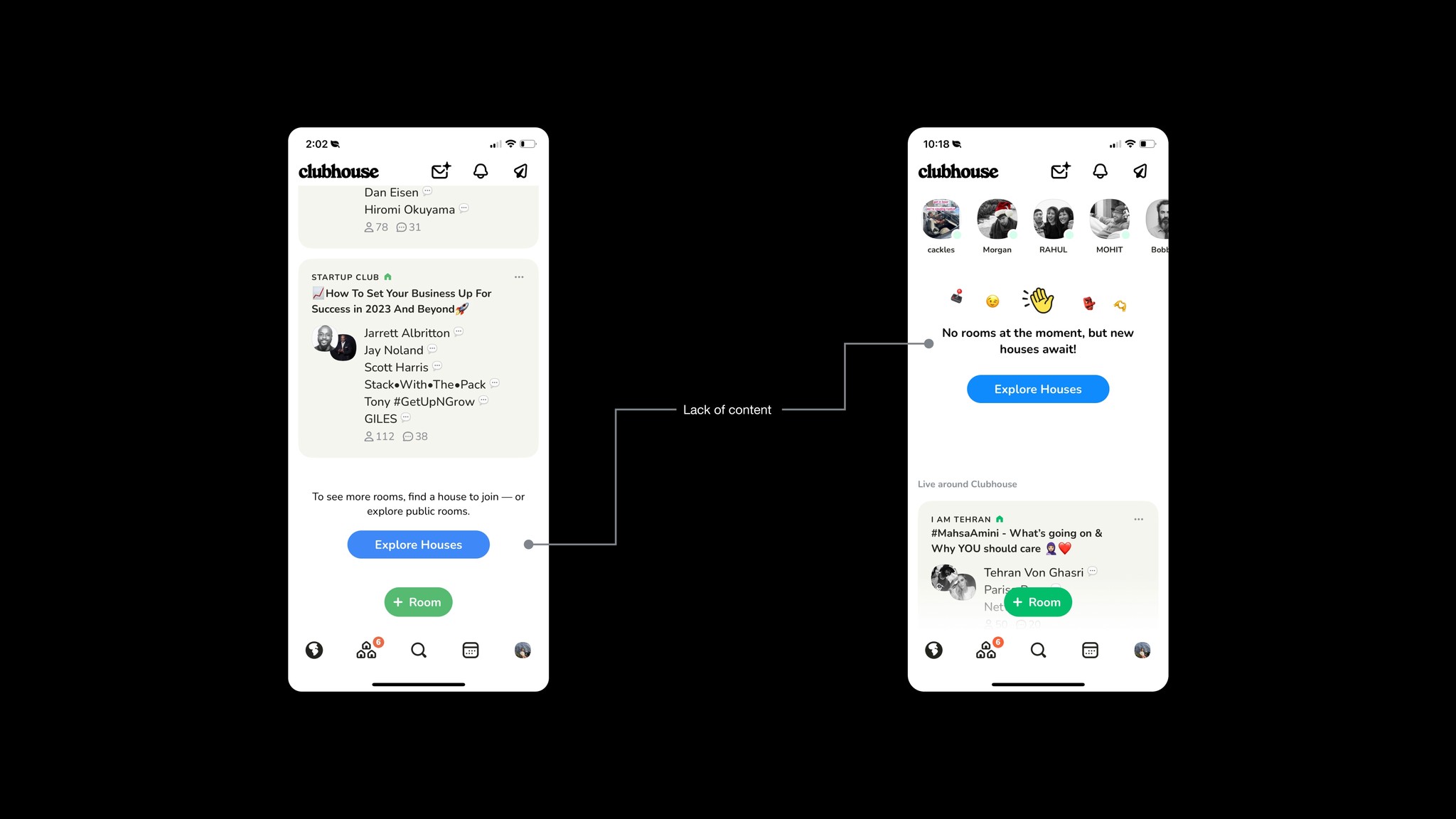
Since the hype has died down, less content is available at a given time or it may not be perfectly crafted to the user's interest graph. The pressure on the user increases to find content they like from what is live at that given moment.
.

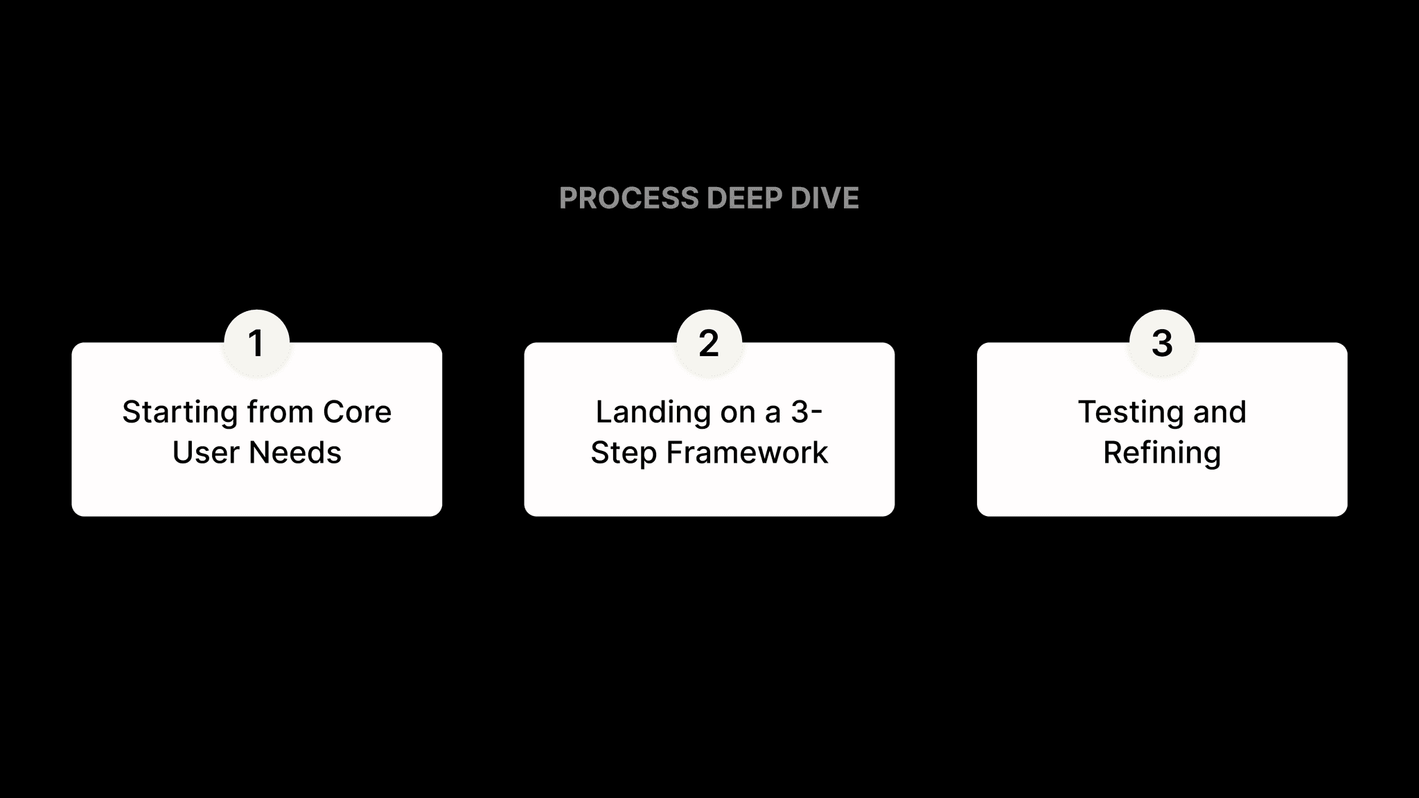
#1 - Starting from Core User Needs
Initial Attempt to Tackle Everything All At Once
My initial designs tried to tackle it through a single solution by trying to address almost all of those pain points at once → Result: A Messy & Cluttered Solution
.
Moment of Reflection
I realized that I can’t solve everything the user tells me at the same time and that I had not found the solution to a fluid browsing experience, but rather made it cognitively taxing for the user to browse rooms quickly.
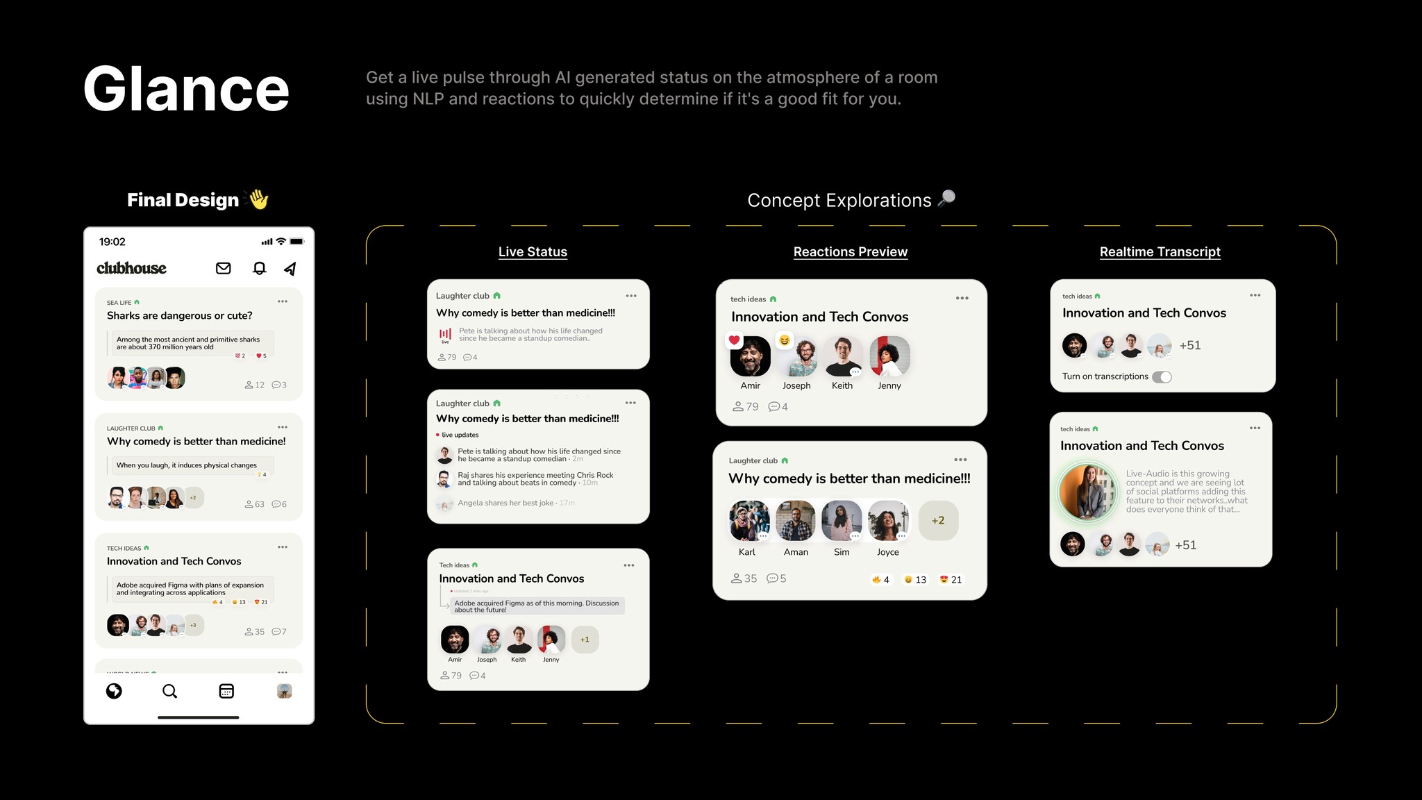
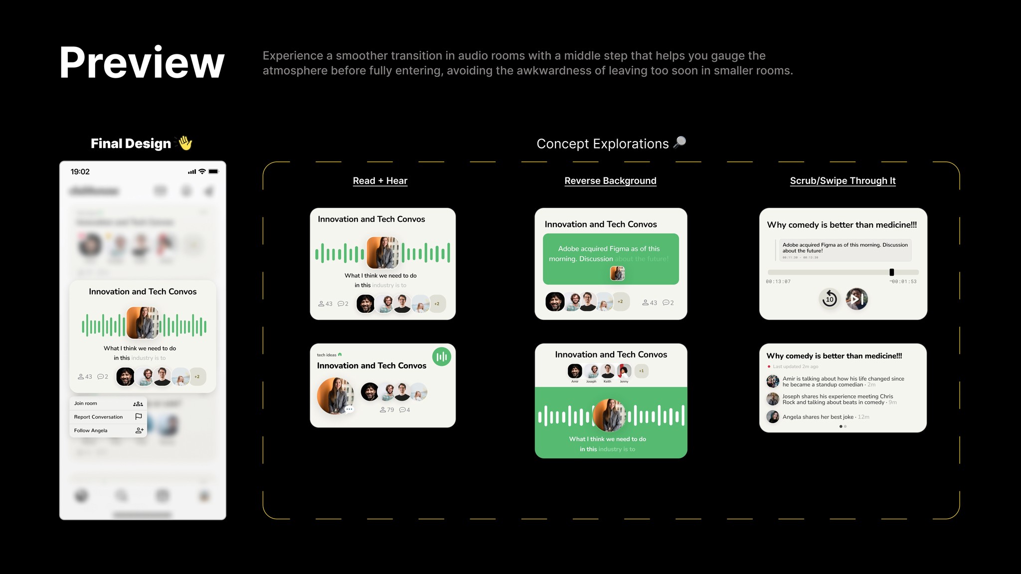
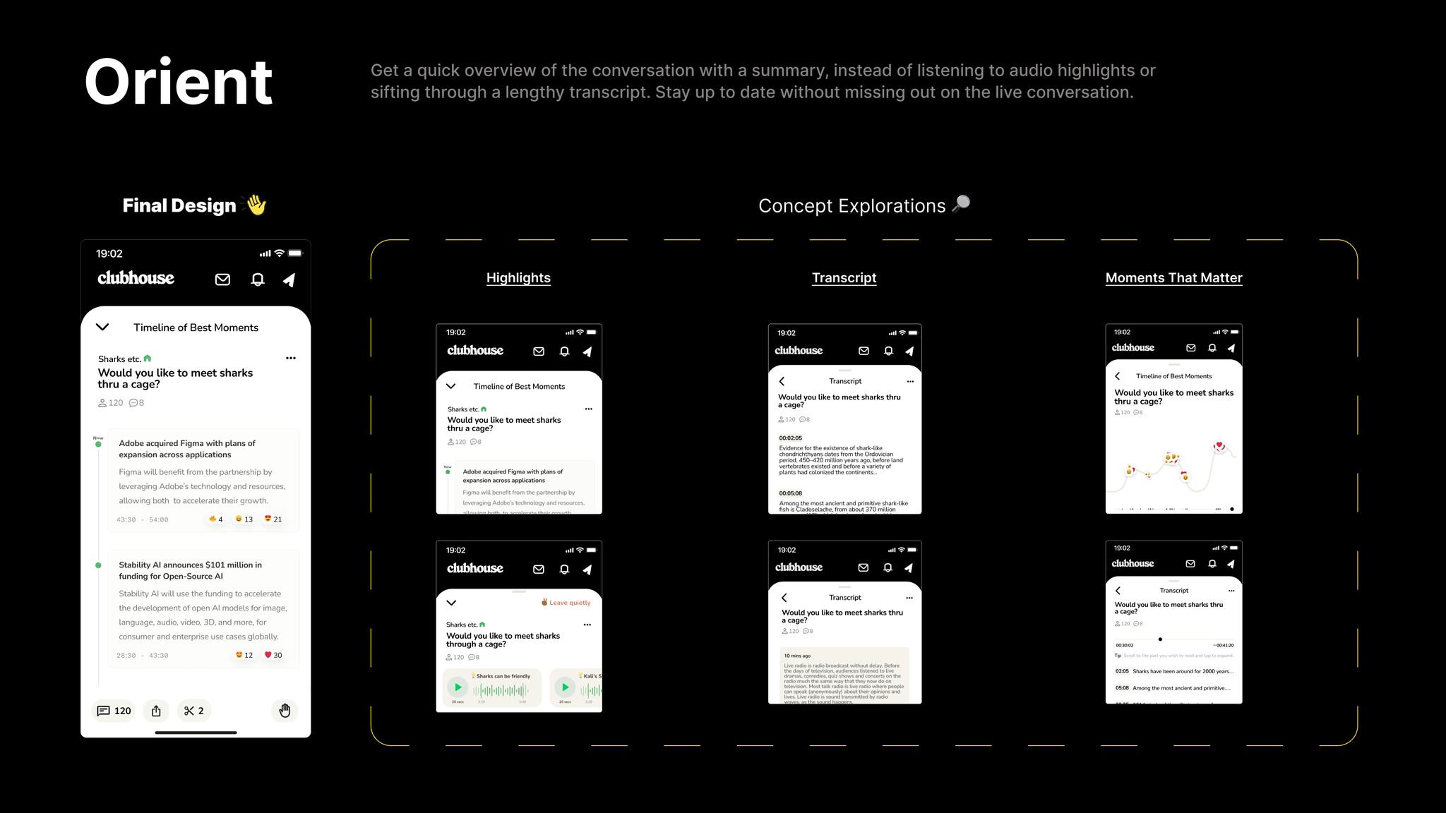
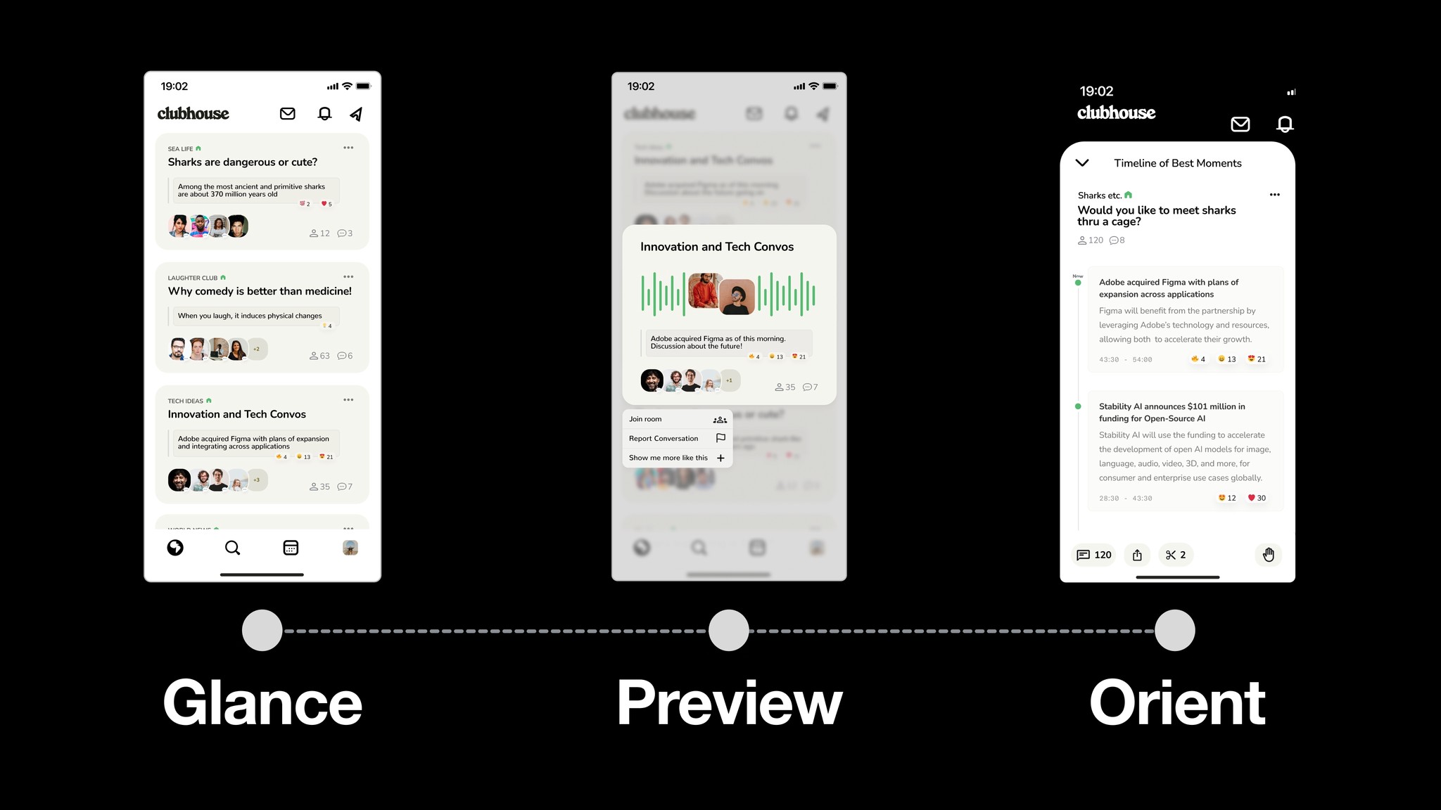
#2 - Landing on a 3 Step Framework: Glance, Preview, and Orient
Auditing Browsing Experiences
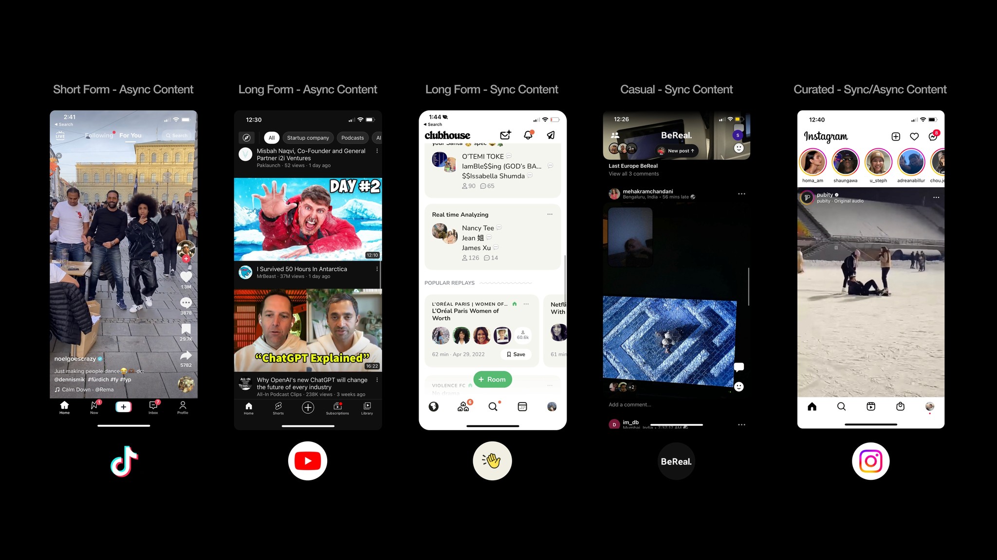
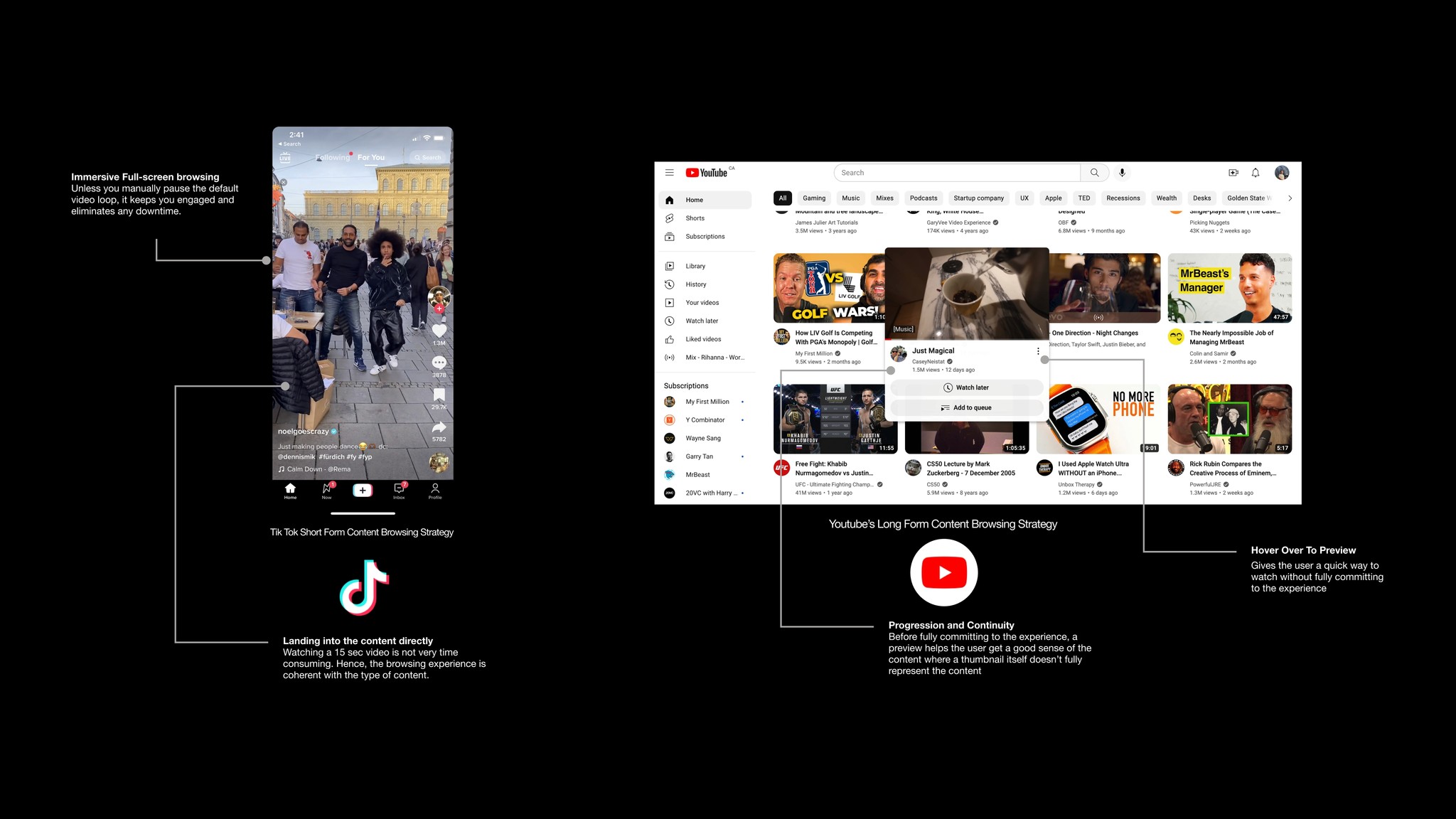
Upon auditing other browsing experiences, I learned the nuances of short form vs long form content. I noticed that short-form content often just plops you into it (TikTok) or even purposely keeps the information inside a secret for anticipation (IG Stories).
In contrast, platforms with long-form content like Youtube gave deeper signals, often even letting you interact with a preview on the browsing screen.
.
Developing The Framework
Through the insights and inspiration I crafted a three part framework. (GPO) Glance-Preview-Orient.
.
.
.
#3 - Testing and Refining
Putting The Pieces Together
Deciding at each stage which of the components makes the most sense to form a cohesive and fluid experience.
.
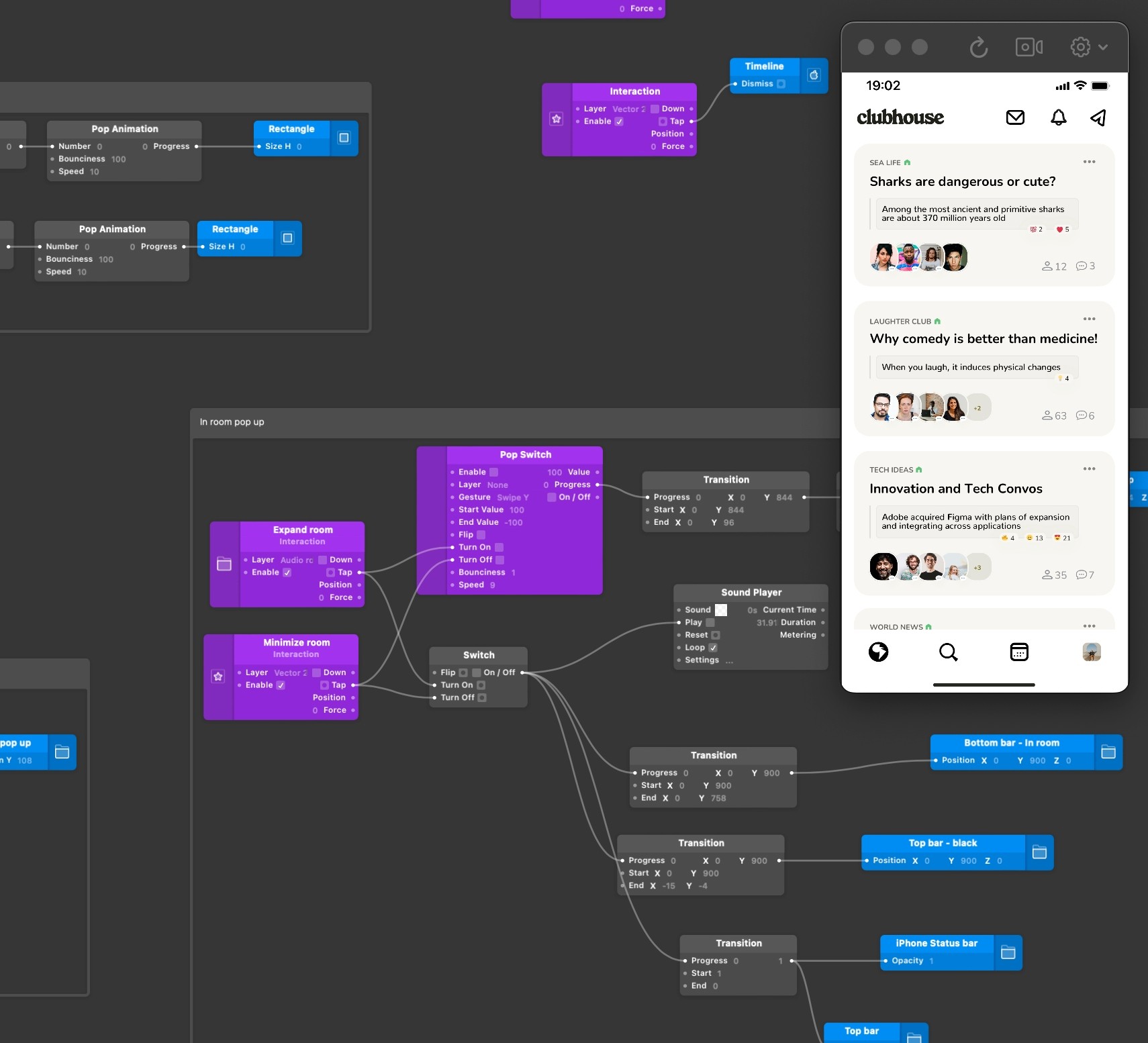
Nailing The Feel
Finally, I spent time prototyping and nailing the animations in Origami to ensure it felt like a fluid experience end to end.
.
FINAL SOLUTION
Crafting a Dynamic User Experience with Gradual Context
In order to create a seamless and effortless experience, I am gradually increasing the context provided to the user as they move through the three stages of the flow. The goal is to establish a smooth and continuous progression that empowers the user and helps them understand the dynamic nature of the experience.
.

Shahvir Sarkary